
22 April 2020
US Equities Post Mortem: Cheap or Small, What Dragged Them Down?
If degradation of US economic forecasts continues at the current pace, the hard fate endured by US equities in March may well be looked back upon as the warning bump of forthcoming quakes. Only time will tell, but getting a sense of the dynamics at work in the sudden air pocket the markets went through earlier this year will help investors sail through these new uncharted economic waters.
In this note, we introduce the post mortem examination we carried out on the top 2000 US stocks (ranked at year-end 2019), relying on the visual analytics of Sismo to convey the common features observed in the market turmoil.
Small Caps Lagging Behind
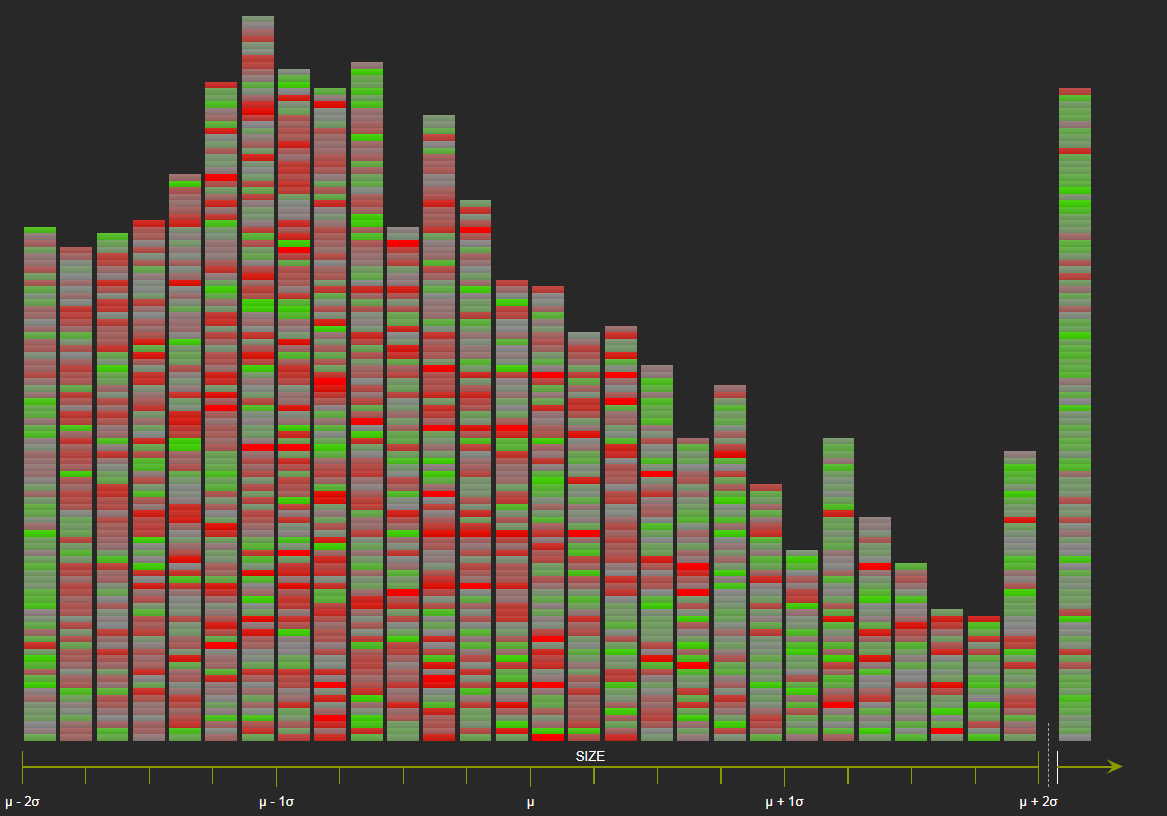
Size is our point of entry: since February, the small and mid-caps stocks have been the most affected by the US equity market downfall. The Russell 2000 index is down 26% year-to-date (17 April), over two times worse than the large cap-Russell 1000 index (-11%). Larger companies have on average better access to financing and stronger competitive positions and it should come as no surprise that they fare better in market downturns.
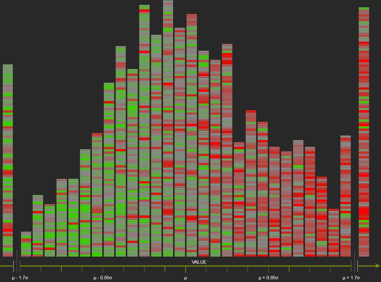
Dominance of red color on the left part of the chart below provides evidence of this. The red-green gradient reflects below-average (red) or above-average (green) total return from 31st Dec. 2019 to 15 April 2020. It is overlaid on top of the distribution along the x-axis of the top 2000 US stocks per their pre-crisis capitalization, at 31st December 2019, with small caps standing on the left and blue-chips on the right. The largest stocks in the right tail are mostly green, with a few reddish exceptions such as Boeing, Wells Fargo, Exxon Mobile, Citigroup, etc.
Top 2000 US Stocks – Market Capitalization Distribution at 31 December 2019 (x-axis)
Colored with 31st Dec. 2019-15 April 2020 Total Return vs Average (Red-Green Color Gradient)
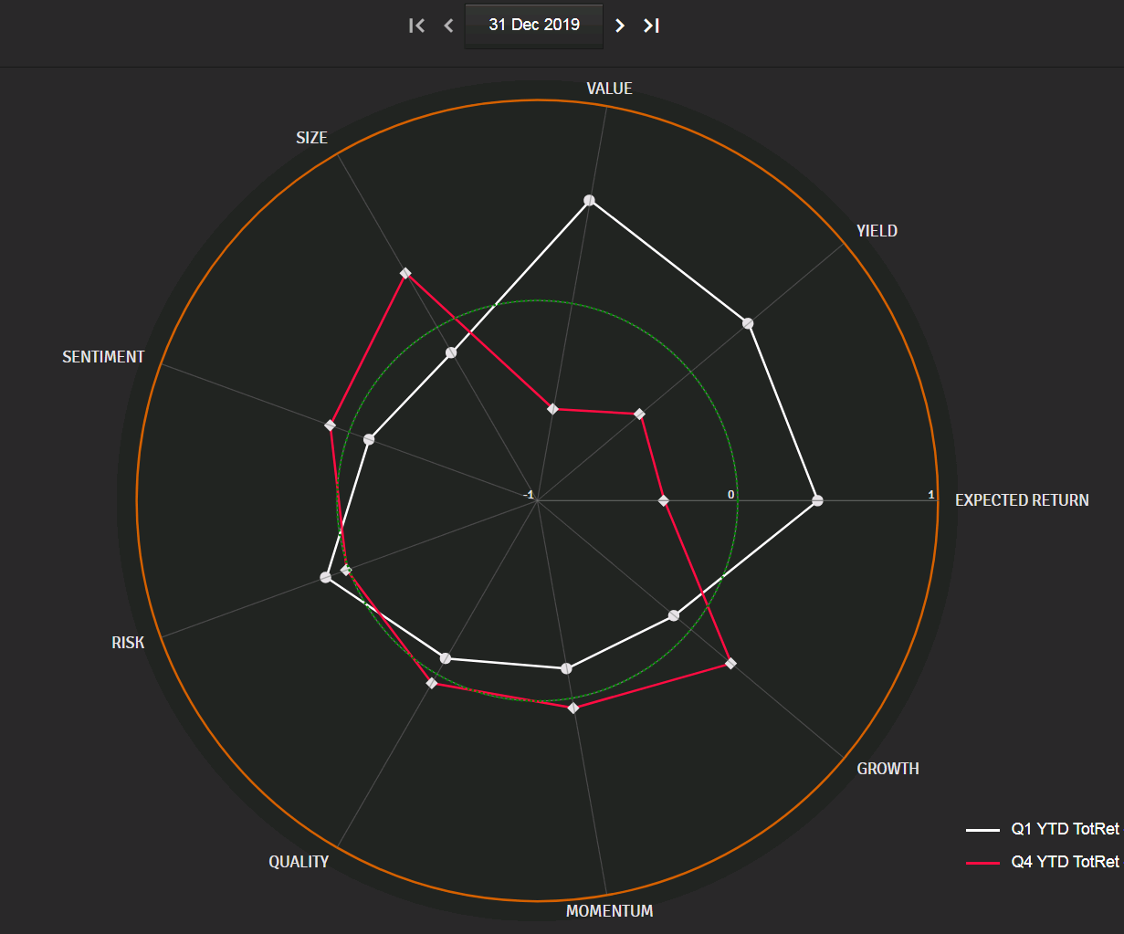
Small vs Large: more Risk, less Quality
What are the common features of small caps that kept them lagging behind their large caps counterparts? To answer this question, we split our universe of 2000 US equities by size quartile, pre-crisis at 31st Dec. 2019, from Q1 (bottom 25% of capitalizations) to Q4 (top 25%). On the polar chart below, the white line indicates the average factor profile at 31st Dec. 2019 of stocks in Q1 (bottom quartile) and that of Q4 (top quartile) in red, while the overall universe is represented by the green dotted line and set at zero. Note that in Sismo, portfolio managers can define the specific factors that are relevant to their own investment objectives (in the form of a weighted linear combination of financial indicators) or, alternatively, use the off-the-shelf Sismo-defined factors that are widely accepted in academic research (the ones used here below).
Factors Exposure at 31st Dec. 2019 of Bottom Quartile (White) and Top Quartile (Red)
of Top 2000 US Stocks Ranked by Market Capitalization
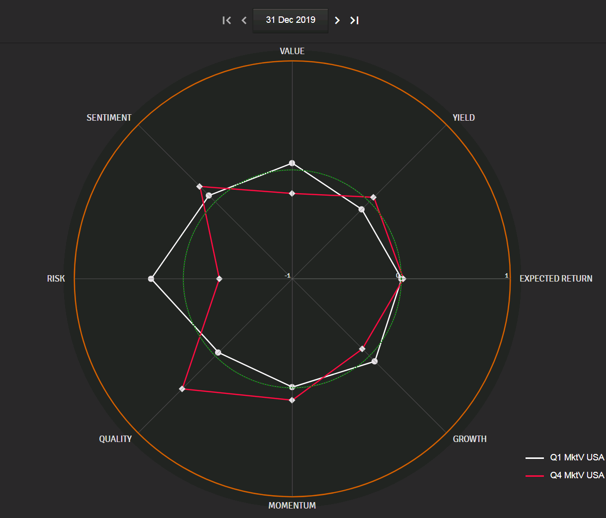
In the above chart, the gap between the average exposure of the top 500 stocks at 31st Dec. 2019 (red) and that of the bottom 500 stocks (white) among our universe of 2000 US stocks is noteworthy on:
-
- The measure of Risk – defined here to characterize high volatility, high beta stocks that are prone to sudden drops in stock price (negative skewness) –, which appears significantly higher at year-end 2019 on US small caps (white) than on large caps (red);
- The Quality factor, based on financial leverage, return on equity and return on capital employed, for which large stocks fare better on average, with lower debt and better returns than small caps.
From Ex-Ante Exposure to Ex-Post Returns: What Eventually Happened to Stocks Ranked by Factor at Year-End 2019?
Small caps had higher exposure to Risk and lower Quality at year end 2019 but how were such exposures to factors linked to stock returns in 2020? To answer this, we have grouped in quartiles our universe of 2000 US stocks for each factor at 31st Dec. 2019 and measured the average return of the quartiles from 31st Dec. 2019 to 15 April 2020. The results are presented in the chart below.
31 Dec. 2019-15 April 2020 Average Total Return of Quartiles Formed
With Each Factor’s Exposure at 31st Dec. 2019 on Top 2000 US Stocks
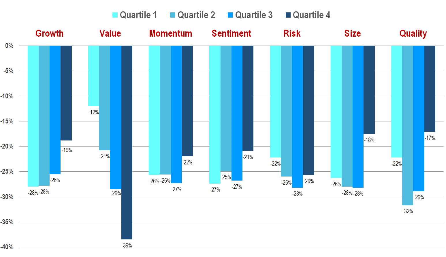
The ex-ante (i.e. Dec. 2019) exposure to the Value factor appears as the most differentiating factor among stocks, on the basis of their subsequent performance (31st Dec. 2019 to 15th April 2020 total return), with low Value stocks at 31 December 2019 (i.e. expensive stocks) faring much better in 2020 (up to 15th April) than high Value (i.e. cheap) stocks. However the Q4 shift for Size and Quality are noteworthy per se. Additional analysis (that is not reproduced here) has been carried out on the dataset based on double sorted series to exclude correlations among factors linked to the same explanatory factors. It indicates that the Q4 Quality return is actually driven by Size (high Quality stocks are mostly large caps) whereas the Value and Size effects are overall independent and cumulative.
On Why Value Matters: Confirming Results With Retrospective Analysis
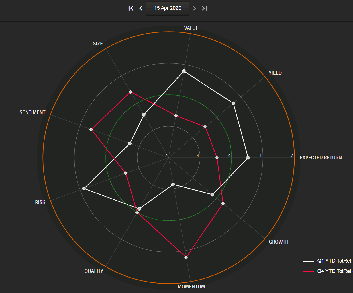
To confirm the trends spotted on pre-crisis exposure to factors, we have run our analysis backward and grouped by quartiles our 2000 stocks per their 2020 year-to-date (ie 31st Dec.-15 April) total return (from Q1 = stocks with bottom 25% return, to Q4 = stocks with top 25% return) and we lay out below the factor exposure of Q1 (white line) and Q4 (red line), (i) at 15 April 2020 and (ii) at 31st December 2019.
Average Factors’ Exposure at 15 April 2020 of the 1st Quartile and the 4th Quartile of 2000 US Stocks Ranked by Current Year-to-Date Total Returns (31stDec. 2019 to 15th April 2020)
Average Factors’ Exposure at 31 December 2019 of the 1st Quartile and the 4th Quartile of 2000 US Stocks Ranked by Current Year-to-Date Total Returns (31stDec. 2019 to 15th April 2020)
At 31st December 2019, in the chart immediately above, the most differentiating gap between the subsequent top 25% performers (in red) and the bottom 25% performers (in white) is yet again the Value factor (as Yield and Expected Return are generally correlated with Value, with cheap stocks on trading multiples basis exhibiting higher dividend yield –D/P- and earnings yield – E/P).
A Value Crisis?
The chart below is similar to the one presented at the beginning of this note, that laid out the 2020 year-to-date relative total return in a red to green color-gradient on top of the distribution of stocks per market capitalization at 31st December 2019. In the chart below, the color gradient carries the same information but it is now overlaid on top of the Value factor distribution at 31 December 2019 instead of the Size factor.
The correlation here is even more striking between ex-ante (Dec. 2019) Value exposure (on the x-axis, with low Value/expensive stocks standing on the left and high Value/cheap stocks on the right) and ex-post (31st Dec.-15 April) above average (green) or below average (red) total return.
Top 2000 US Stocks Value-Exposure Distribution at 31st December 2019 (x-axis)
31st Dec. 2019-15 April 2020 Total Return vs. Average (Red-Green Color Gradient)
Or a Sector Crisis?
The same information is displayed in the chart below with relative total return year-to date in red-green gradient but with the ex-ante exposure to Value now distributed in spiral from low-Value (expensive stocks) in periphery to high Value –cheap stocks in the center.
In addition, we have introduced tiles with icons indicating the median position of each sector. In the central part, you’ll notice the reddish oil & gas (drop icon), automotive (tyre icon), banks, insurance and financial services icons, all high-Value stocks directly hit by the market turmoil. In the periphery, stand the greenish Pharmaceuticals & Biotechs (left), Healthcare Equipment, Software and IT, Household & Personal Equipment (on top), all low-Value stocks that proved more resilient to the current crisis.
Top 2000 US Stocks Value-Exposure Distribution at 31st December 2019 (from Bottom at Periphery to Top in the Center) With Sectors Median Tiles, Colored with 31st Dec. 2019 -15 April 2020 Total Return vs. Average (Red-Green Color Gradient)

So, could this Value-exposure thing be nothing more than relative exposure to certain sectors that were, for good reasons, directly affected by the current crisis?
To find out, we neutralize the effect of belonging to a specific sector by reordering the above chart, choosing for the tile position (in spiral from periphery to center) not the Value exposure at 31st December 2019 but the Value exposure at 31st December minus the sector’s median Value exposure at the same date. As a result, all sectors icons (that borne median values of sectors in the previous chart) are now grouped together at a neutral position, after taking out the median position of each Sector.
Distribution of Stock Value-Exposure Minus Sector Value-Median-Exposure on Top 2000 US at 31st December 2019 (from Bottom at Periphery to Top in the Center), Colored with 31st Dec. 2019 -15 April 2020 Total Return vs. Average (Red-Green Color Gradient)

The correlation position/color is lessened (reflecting the weight of sector belonging) but it is still present.
To visually highlight the concentration of reddish tiles in the center part of the chart above, we have greyed out in the chart below the bottom 50% of stocks on the Value exposure at 31st Dec. (i.e. the 50% of stocks in peripheral positions) and the top 50% of stocks on year-to-date total return (i.e. the top 50% greenish stocks in the color gradient). This filtering should leave only 1/4th of tiles visible if both variables were independent.
The actual number of visible tiles in the central part of the chart below is higher. It accounts for 30% of the distribution, thus confirming the overall underperformance of Value stocks (and outperformance of low Value stocks) irrespective of the sector to which they belong.
Distribution of Stock Value-Exposure Minus Sector Value-Median-Exposure on Top 2000 US Stocks
at 31st Dec. 2019 (From Bottom at Periphery to Top in the Center)
31st Dec. 2019-15 April 2020 Total Return vs Average (red-green color gradient)
Bottom 50% Universe Filtered Out on Value Exposure – Top 50% Universe Filtered Out on Total Return

To sum up, we have underlined two key factors in the 2020 downfall of US stocks: the Size effect (small stocks fell harder) and the Value effect (cheap stocks on trading multiples basis fared worse than “premium”/expensive stocks, an assumption valid for sectors but also for individual stocks beyond the effect of belonging to a certain sector).
Looking at the 2009 Precedent
Before we conclude our 2020 post mortem analysis, let’s consider what happened during the last stock market crisis, in 2008/2009. On 9 March 2009, the US indices hit their bottom, after a long fall that started in the summer of 2008. It took them a year after March 09 to get back to their pre-Lehman levels. We have run our backward factor analysis at that moment, 1 year after the bottom of cycle, ranking US stocks based on their 1-year total return at 9 March 2010 and grouping them in quartiles from Q1 (bottom 25% performers) to Q4 (top 25% performers).
What were the average factors profiles of Q1 and Q4 (defined at 9 March 2010) 1 year before, at 9 March 2009, when the markets bottomed out? The answer (on a group of 1350 US stocks) can be read in the chart below with Q1 (bottom 25% ex-post 1Y return) in white and Q4 (top 25% ex-post 1Y return) in red.
Factors Exposure at 9 March 2009 of the 1st Quartile and the 4th Quartile of 1350 US Stocks Ranked
by 1-Year Total Return (9 March 2009 to 9 March 2010)
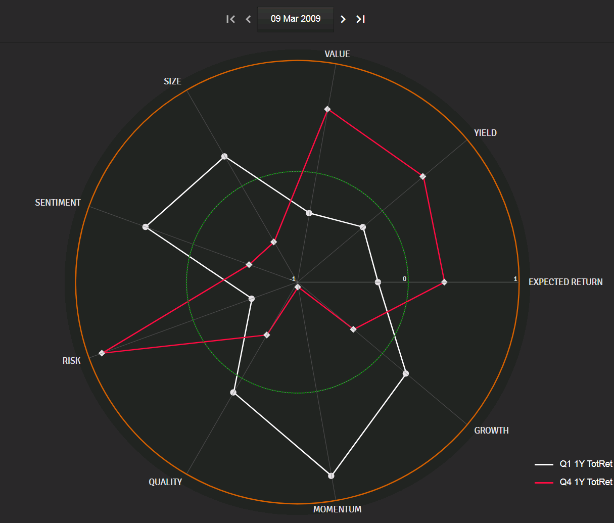
The stocks that benefited most from the 1 year market recovery in March 2010 (red line above) had, in March 2009, a strong positive exposure to Value (cheap stocks on a trading multiples basis) and Risk and a strong negative exposure to Size (small caps).
This is confirmed on the Sismo view below, where we map our universe of US stocks in March 2010:
- per their exposure to Value at the bottom of market on 9 March 2009 (on the x axis, from left to right and from min to max, each column representing a quartile)
- per their exposure to Size at the bottom of market on 9 March 2009 (on the y axis, from top to bottom and from min to max, each row representing a quartile)
- per their ex-post 1-year total below average (red) or above average (green) total return on 9 March 2010
1350 US Stocks Mapped per their Value Exposure at 9 March 2009 (X axis from left to right) and per their Market Capitalization at 9 March 2009 (Y axis from top to bottom), and Colored per their 1Y Subsequent Total Return (9 March 2009 to 9 March 2010), from Red (below Average) to Green (above Average)
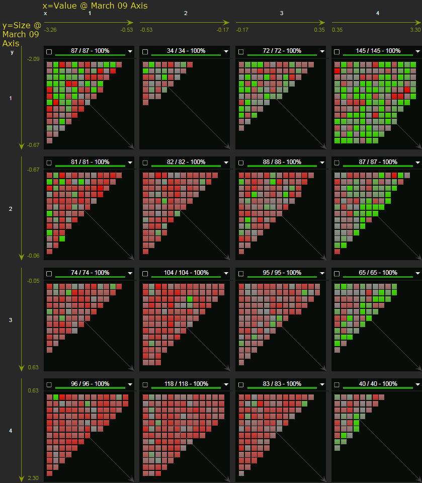
The ex-post outperformers (greenish tiles) are mainly located in the last column (top quartile of ex-ante Value exposures) and in the upper row (small caps) while those 2 factors together exhibit limited correlation at the bottom of the cycle (most big blocks above are equally populated).
What Do We Take From This?
-
- In Q1 2020, stocks with ex-ante (Dec. 2019) positive exposure to Value (cheap stocks) and negative exposure to Size (small caps) suffered most from the market downturn
- In 2009, stocks combining these two exposures at the market bottom are those that benefited most from the subsequent turnaround in the next 12 months
***
If this note sparked some interest and made you think, we would love to hear your comments at contact@sismo.fr. This study on the US equity market illustrates the analysis and visualization capabilities of Sismo, a visual analytics platform with direct web-access designed for discretionary equity portfolio managers that is integrated with European and US equity coverage from S&P.
Sismo combines innovative visualizations with advanced user interactions to facilitate the reading and understanding of market dynamics, select stocks, define and test investment strategies. It offers innovative screening and back-testing functionalities as well as investment style recognition and marginal portfolio optimization, leveraging on visual analysis capabilities to improve professionals’ investment decisions. Please visit www.sismo.fr.
***
2,995 total views, 4 views today